As I grow as an author, I feel I’m learning more about how to be ‘marketer’ (not that I’m not learning more every day about how to be a better author, but my ‘marketing skills’ were/are so woeful that I have sooo much to learn). But thanks to the web and some very smart – and generous -people, I’ve learned a few important things.
Perhaps one of the most important is that visuals are really helpful. It’s easier to catch someone’s eye with a picture, video, drawing, graphic, etc, than it is with just text. I’d kinda known that – hence the pictures everywhere, – but then someone took it a step further and said, I – not me per se, but people in general – needed an avatar that I could/would use on all platforms that would be recognizable as mine. I think I found such an image.
Lily Velden helped me come up with it and the graphic artist is Laird Geoffrey Mead. Pretty cool, no?
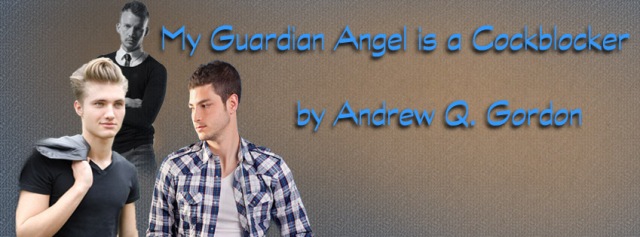
In addition, since I started a new Wednesday Brief Story, I asked my friend Alicia Nordwell to create a cover and banner for the posts. Here’s what she came up with:
Again, I rather like it and it does fit the story. So thank you to Cia – who by the way, does freelance covers and banners. If you’re in the market for some, her prices are reasonable and she is super easy to work with.


Leave a Reply